Card sorting | UI Design | Prototype
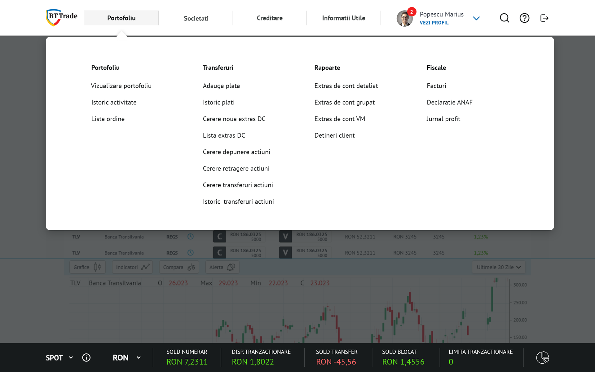
I'm presenting here a small part of BT Trade's website, more specifically designs from Header Navigation Menu and User Profile flows, after passing more usability testing sessions.
Below you can find the prototype link if you want to interact with it's functionalities yourself: https://xd.adobe.com/view/fbbf289a-97c3-486d-9d32-9149d5bf4fd9-aeec/?fullscreen
Adobe XD, Zeplin, and InVision were some of the main UI tools that helped me in the process of designing the screens, developing the prototypes, and handing-over my work to the development team.
* Card sorting was a great technique for breaking down and organizing chunks of data in a user-friendly manner. A lot of card sorting was involved in order to reach the most efficient information hierarchy inside the sub-navigation menu.
Header navigation menu UI elements interactively displayed inside this project:
1. horizontal navigation with main pages and their states (default / hover / selected)
2. sub-navigation menu | detailed dropdown menu with categories and subcategories (see card sorting above)*
3. user profile menu and different settings: switch between accounts, change language, change theme
